Revamped Landing Page and Sales Materials
Illustrated graphics, wrote copy, and built website with refreshed, problem-to-solution messaging

Dates
Q2 2024
Role
UX/UI Designer, Brand Designer, Copy Writer, No-Code Web Developer
Stakeholders
Product Co-founder, Sales Co-founder
Tools
Figma, Framer, Google Drive
Sales Materials Redesign That Doubled Customer Growth Rate
Context
Presta is an early stage start up creating end-to-end lending software for community based lenders. Presta's sales materials have slowly morphed overtime becoming inconsistent and outdated. We need to refresh all of our branding materials based on new learnings.
Impact
6 customers gained in Q3 and Q4 leveraging new sales materials, while previous average was 3 customers gained per quarter for Q1 and Q2
1 customer requested a copy of the deck. This has never happened before!
1 customer signed up for a demo organically via website!
Problem
Presta’s Sales Materials Are Underperforming
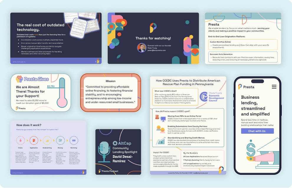
A sampling of sales and marketing materials made from 2022 to 2023.
Inconsistant Branding
Over time, Presta's branding grew inconsistent due to rebranding and incremental tweaks to the sales materials over time. This inconsistency deteriorates trust, looks unprofessional, and feels off.
Distracting Graphics
Presta's original graphics were decorative. They distract rather than communicate Presta's value add.
Outdated Copy
We have learned a ton about what customers want out of Presta, these new learnings are not included in the sales materials causing us to loose out on sales.
Solution
Updated All Sales Materials from Decorative to Communicative with a Problem-Solution Narrative
I updated all of our most vital sales materials, including our intro deck, website, one-pager, and demo video, to ensure they all were consistent and clearly communicated Presta's value add at a glance.
“Better materials lead to better outcomes for the sales team.”
- Leo Peña, CEO at Presta

Chart illustrating how many customers we had at the end of each quarter from 2023-2024.
Revamped Sales Intro Deck

A sampling of slides from the revamped sales into deck.
Revamped Website Landing Page
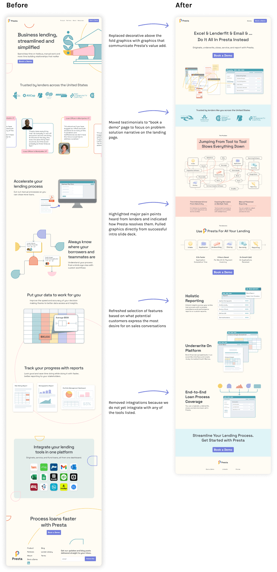
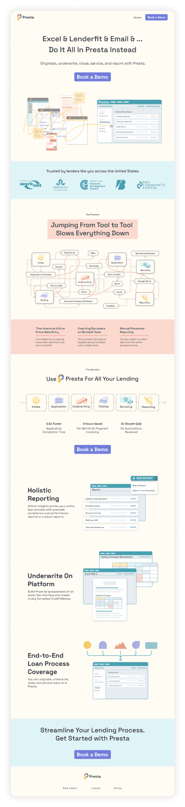

The old Presta landing page compared to the new Presta landing page.
Revamped One Pager / Conference Flyer

The front of the old Presta one-pager compared to the front and back of the new Presta one-pager.
Visual Exploration
Exploring Visual Identities That Match Our Brand Descriptors: Secure, Innovative, Breaks Old Systems, Trustworthy, Professional
The sales team created an new intro deck that communicates the cost of sticking with current lending systems. Our customers are comfortable with the status quo and reluctant to change. So we have to show them, with data, why Presta is much better.
The issue is, the deck the sales team provided does not mesh with our existing branding and feels visually under-par. I was tasked with redesigning these slides.
Original (deck provided by sales team)


Branding Explorations
I designed the same 3 slides with different branding options, exploring different ways to interpret the Presta brand descriptors visually. We ended up going with option 2.


Option 1: Secure with solid, unbreakable graphics and thick lines. Innovative with organic, curvy shapes, and bold colors.


Option 2: Secure and trustworthy with minimal, muted, soft, and consistent visuals. Breaks old systems with at least one stand out graphic per slide. Professional with simplicity and white space.


Option 3: Trustworthy with friendly, rounded shapes. Innovative and breaks old systems with unique, unexpected layouts.
Design System
Building Out The Refreshed Brand Design System
After we determined which visual identity we wanted to use, I build out a new design system for our sales materials.

Hone Message
Using Information Hierarchy and Representational Graphics to Convey Problem-Solution At A Glance

The original header graphic for the website was fairly vague, I redesigned the graphic so it clearly showed how Presta takes a messy, multi-tool process and combines it all into one streamlined tool.
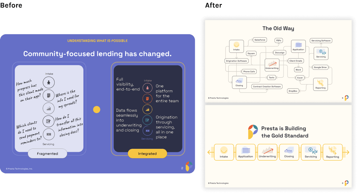
The provided slide was hard to understand and had many elements competing for attention. I iterated on this slide and ultimately decided to split it up into two slides, so I could use info hierarchy to highlight the key takeaways which were the existing process is fragmented and Presta's process is integrated.
Impact
Revamped Sales Materials Lead To Doubled Customer Growth
Went from an average of 3 to 6 customers gained per quarter
2x Customer Growth Rate
With an average of $9.7K ACV per customer, this brings in an
Additional ~$29K in Annual Revenue
The new sales materials pointed out the flaws in the current outdated lending processes and proved that Presta is better. This story driven approach, supported by data, convinced more potential customers to make the switch to Presta. The updated designs enhanced the story and helped lenders quickly understand "Why Presta".
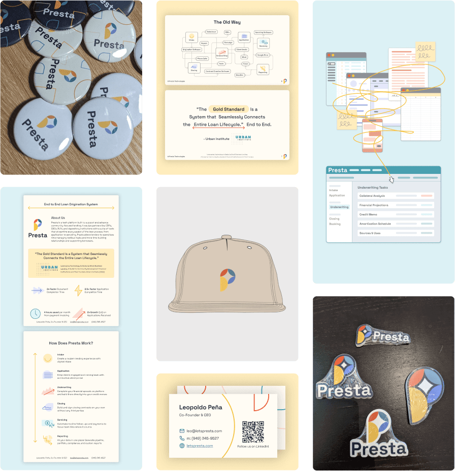
A sampling of the updated branding and sales materials.